Chapter 5 Pretty plots with ggplot2
As you may have gathered by now, I strongly believe that learning (R) should be fun in order to motivate people to keep going.
I also strongly believe that being able to literally look at your data is immensely helpful in understanding the type of statistics you can calculate with it, what the distribution looks like and what generally we are dealing with.
Therefore, we will learn how to make our data visible to both us and others and get to know ggplot2 as powerful data visualization package from the tidyverse
5.1 Data Visalization
Data Visualization or data viz for short is an important part of reporting any data in any context. Drawing a pirate map where X marks the spot could be data visualization as well as a professional statistic of political vote tallies in bar plots. In general, humans are very visual creatures, so readers/ listeners can follow along more when there is something to look at that illustrates the point.
# Warning: package 'flametree' was built under R version 4.5.3
# Warning: Using `size` aesthetic for lines was deprecated in
# ggplot2 3.4.0.
# ℹ Please use `linewidth` instead.
# ℹ The deprecated feature was likely used in the
#   flametree package.
#   Please report the issue at
#   <https://github.com/djnavarro/flametree/issues>.
# This warning is displayed once per session.
# Call `lifecycle::last_lifecycle_warnings()` to see
# where this warning was generated.
The type of visualization to choose strongly depends on what we want to accomplish, who the audience is and of course on the general setting. While the so-called flametrees above are nice to look at, the don't tell us too much about any data as-is. With reporting statistics, however, we want to be able to see our data ¯\_(ツ)_/¯. Having a visual representation can be helpful in understanding relationships between variables which helps us and consumers to interpret the results of analyses more intuitively. Moreover, many common statistics make assumptions about the distribution of our data, so we need to check and test that!
5.1.1 Example: Sine & Cosine
An illustrative example of why it can be very helpful to see data before making assumptions is the relationship between sine and cosine. We won't get too mathematical, but just know they are trigonometric angle functions with a special relationship. Commonly in psychology, relation = correlation, which assumes a linear relationship. However, when we take a look at both the correlation between sine and cosine as well as their relationship represented visually, we might see a problem:
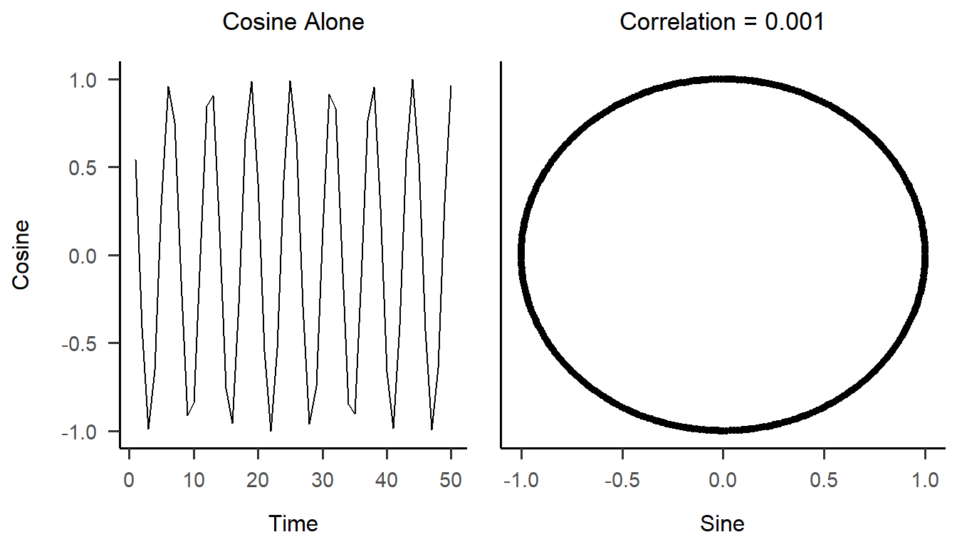
We can see that the two variables clearly have a certain type of relation with each other which is definitely not linear. But if we only reported the very very small correlation of .001, one could assume they had no relation at all! Keeping that in mind, let's see how we can create beautiful and concise visualizations in R!
5.2 What is ggplot2?
First off, it is probably the best data visualization package in R.
Like dplyr it is part of the tidyverse, so you can expect fairly intuitively named functions and a clear structure that you can build up as you go. ♥
If you have not yet installed the whole tidyverse, you can install ggplot2 individually with install.packages("ggplot2").
Once installed, you can load it with library(ggplot2).
With ggplot2 you can build your plots layer by layer.
Here you can see a schematic of the different elements that can be added to any plot:

There are two main functions, or rather types of function in this package.
ggplot()
This is the main function for "opening the canvas", so it basically prepares R for the plot definition.
Commonly, we define the data set (the Data layer of the schematic) and which variables to plot in this function (the Mapping layer).
The mapping needs the aesthetics function aes() as input, in which the variable(s) to be plotted will be defined.
It's important to remember that the package is called ggplot2 while the function call is ggplot!
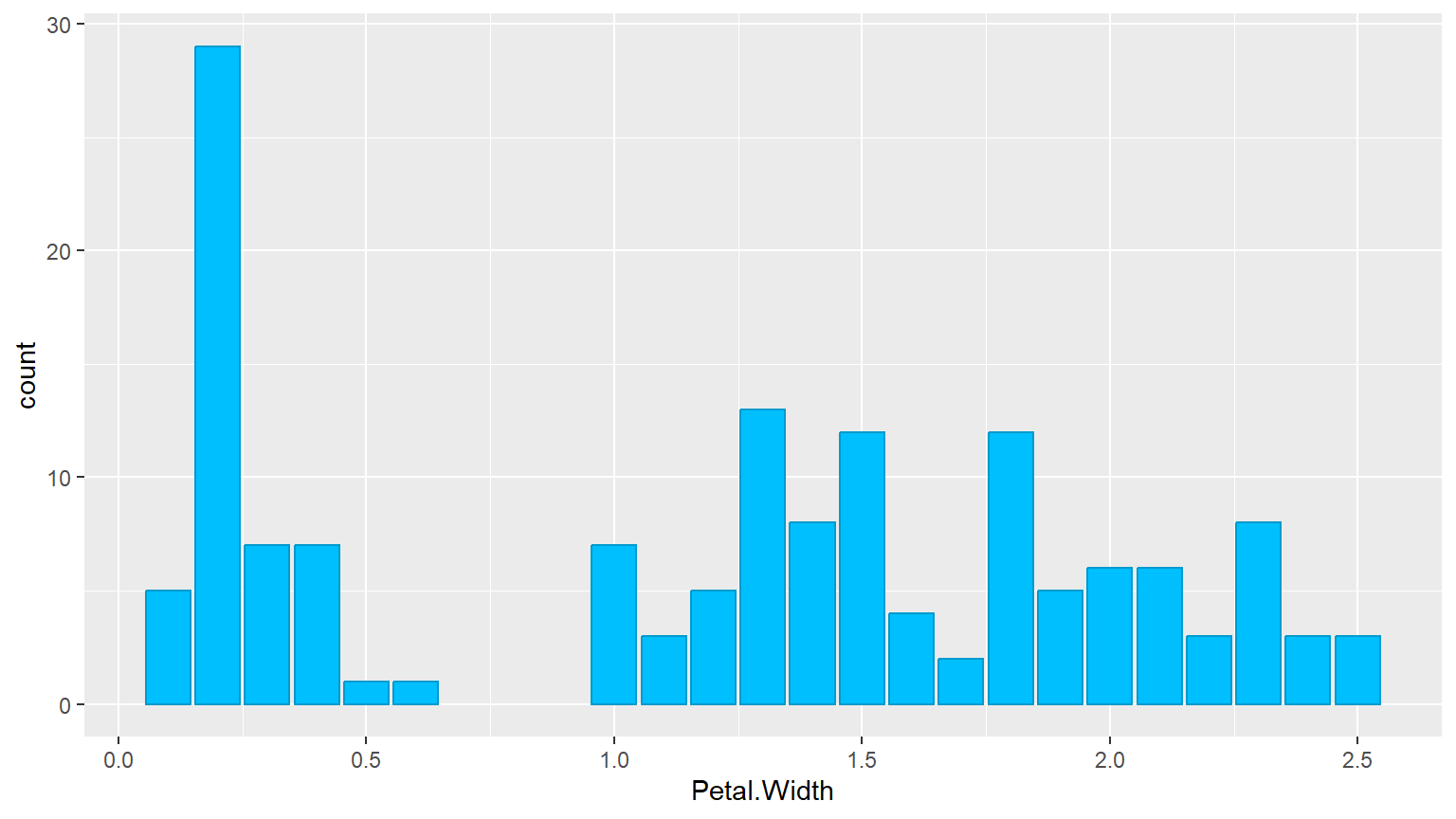
5.3 Your First Bar Plot
5.3.1 Making Plots Prettier
- color
- visual property of the geometric object
- which color for the outlines
colors()
- fill
- visual property of the geometric object
- which color to fill
- labs
- theme
install.packages("papaja")\(\rightarrow\)library(papaja)
5.4 Static vs. Dynamic Aesthetics
- Static Aesthetics: Fixed values applied to all elements of the plot
- Example: color = "deepskyblue3"
- Means every element will have the same color.
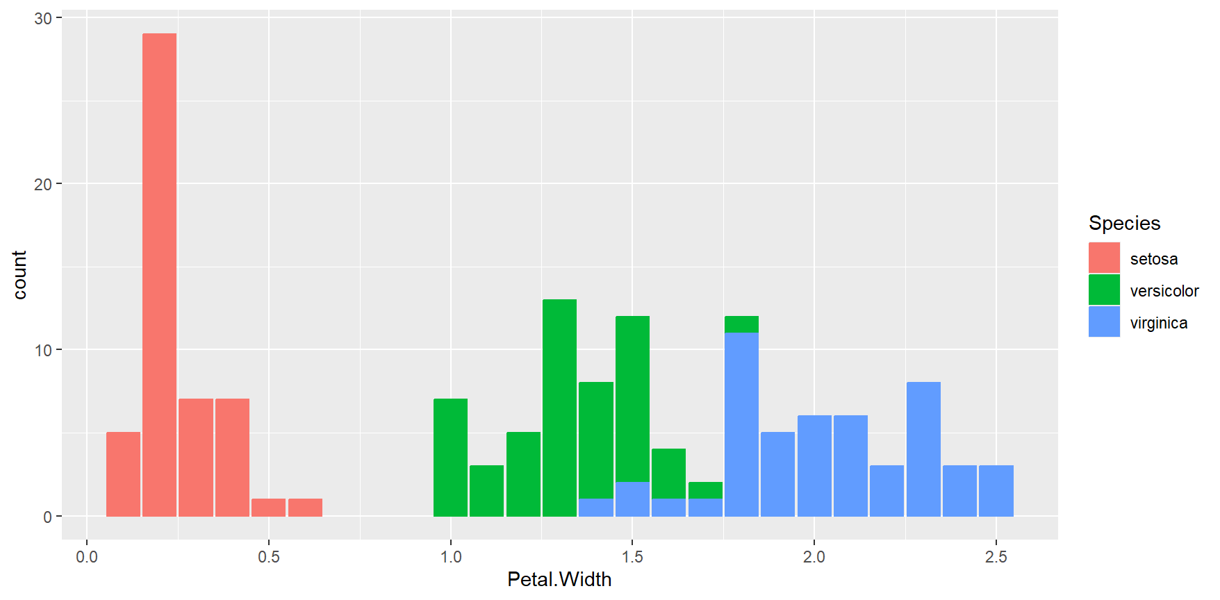
- Dynamic Aesthetics: These map a variable in your data to an aesthetic, which allows different elements to have different colors based on the data
- Example: aes(color = Species)
- Means the color will vary according to the Species variable in the data set.
5.5 Adding labels and themes
- A good plot should be self explanatory and clear
- We need labels to tell others what our plot shows
- Especially when using color for another variable, it needs to be clear what each color means
- Also the gray-ish default background is ok, but neither very pretty nor very clear
- It is sometimes advisable to keep grid lines visible, but sometimes they can be distracting and unnecessary
- ggplot2 has a lot of built-in theme options, but there are many packages that provide their own themes
- Usually my preference is
papaja::theme_apa(), which adheres to APA guidelines
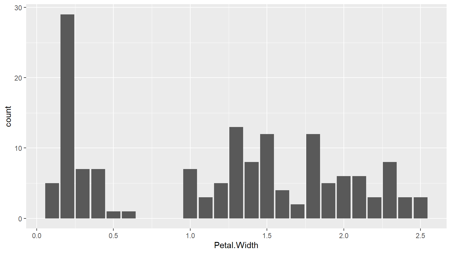
ggplot(iris) +
geom_bar(aes(x = Petal.Width, color = Species, fill = Species)) +
theme_apa() +
labs(x = "Petal Width", y = "Flower Count",
title = "Size of Iris Flowers")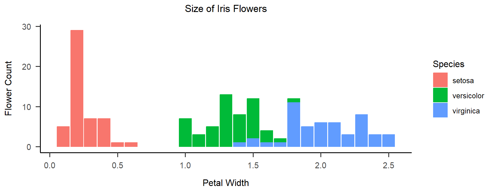
5.6 Bivariate Visualizations
- The bar plot shows the distribution of a single variable
- We can add color to show groups
- Showing the relationship of two variables to each other is crucial for understanding our data
- We can still add color to make existing groups clearer or add a third variable
- For a broad overview of which visualization (and statistic) to use for which type of data, visit the Statistics Picker (currently only available in German)
- Most common are boxplots, scatterplots & line graphs
5.6.1 Boxplot Example
As suggested by one of you, we will look at the relationship of preferred music genre and music volume in our course:
# seminar <- readRDS("./data/seminar_data.Rds")
ggplot(seminar, aes(x=v07_genre, y=v08_loudness, colour=v07_genre, fill=v07_genre)) +
  geom_boxplot(alpha = 0.7) + theme_apa() +
  labs(x = "Preferred Music Genre", y = "Loudness (arbitrary units)",
       color = "Genre", fill = "Genre")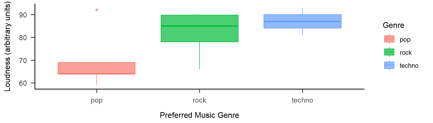
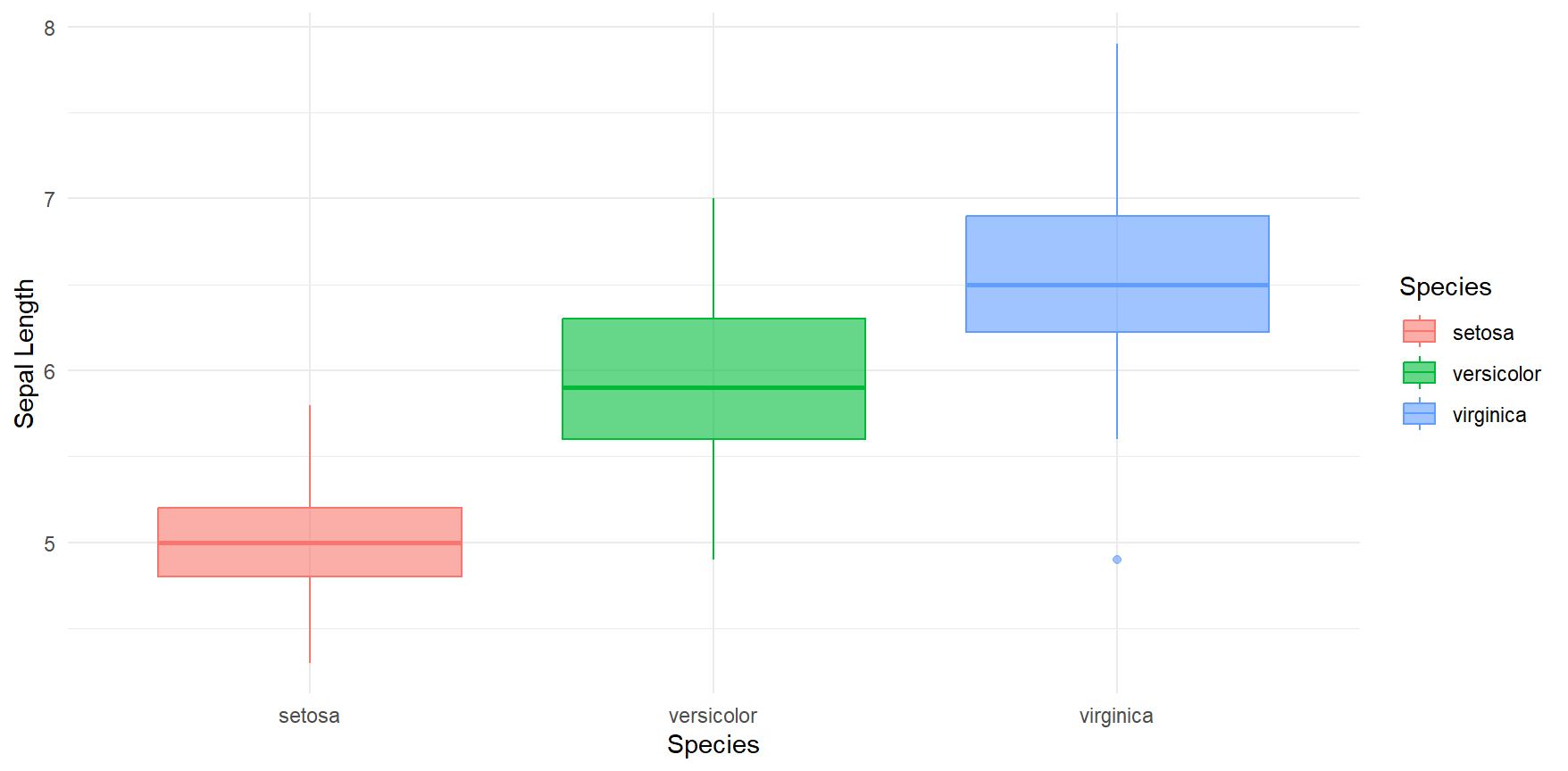
5.6.2 Exercise: Boxplot
Create a box plot that shows Sepal.Length from the iris data set grouped by the Species.
Fill and color depending on the Species.
Make sure everything is visible and legible, so try to use an alpha of around 0.7.
Try to add labels and a theme.
5.6.3 Inspiration: colors and palettes
- These plots have all used the default colors from ggplot2
- There are many options for customization, either:
- Use the "brewer" palettes from
ggplot2withscale_color_brewer()orscale_fill_brewer() - Choose single colors (static aesthetics), check
colors()for R color names - Create a color palette with all colors that you need and use it with
scale_color_manual()orscale_fill_manual() - Use a predefined color palette from packages like
viridisoruniknorRColorBrewer...
- Use the "brewer" palettes from
- Have fun with it!
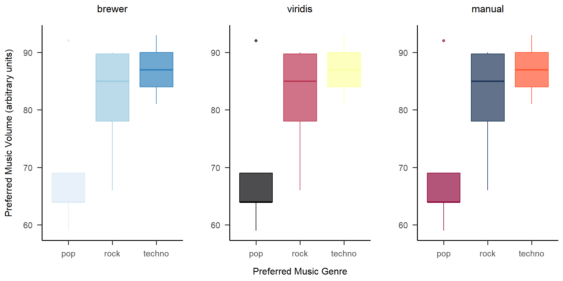
Showing plots together like this is easy with
cowplot::plot_grid()!
Wrap-Up & Further Resources
-
ggplot2is a powerful tool for visualizing data - Plot commands are added together with + and executed as one
- A basic plot is created with ggplot() + geom_XYZ(), e.g. geom_bar
- color & fill give you nice color options (static & dynamic)
- labs() adds labels to the plot (i.e. x, y, title, ...)
- Themes control the background of the plot, e.g. papaja::theme_apa() or theme_minimal()
- Color palettes are a great way of elevating a visualization
- ggplot2 vignette
- R Graphics Cookbook
- unikn
- viridis
- papaja
- From Data to Viz Guide
- Beautiful Plotting Guide Very extensive, I still profit from this guide a lot :)
- More color palettes explained